This Community Welcomes You...or that is what the sign is supposed to say. We see these things at the entrance to most communities, signs that tell us that we have arrived within the boundaries of the community. In Indiana, there are small green signs with white lettering that tell us the name of the town, but then there are the more elaborate signs posted by the actual community that tells us more, or at least it should.
Through my travels throughout Indiana I have collected an exhaustive amount of pictures depicting entrance signs to local communities. These welcome or gateway signs have a primary function of telling you what community you are entering, but if one looks deeper they can discover more about a community's values with these signs. This is the first impression one gets of a community, and it tells you what you can expect. Often the sign will mention what the community is well known for, who its famous residents were, what values the community holds, its history, and in some cases, who is running the government of that community. In this first post, I will examine some of these entrance signs from throughout the Hoosier State and see how different communities look at themselves and their values.
To kick things off, I have what is probably the most famous of welcome signs, the Welcome to Fabulous Las Vegas Sign. Okay, so this isn't an Indiana community, but the sign is such an icon, it even has its own Wikipedia article, and not only that, but there is a dedicated parking lot in the median of Las Vegas Blvd. dedicated just so people can get pictures of this sign. This sign is the symbol of the city, the flashy lights, the boldness; this is what Las Vegas is. The Welcome to Las Vegas sign tells us about the community, what to expect, what values the community has. It doesn't tell us who the mayor is, or what year the city was founded, but it doesn't have to.
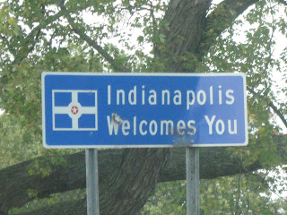
Alright, back home in the capital city of Indiana, we have the Welcome to Indianapolis sign. The sign is nothing facing, just white lettering on a blue background, with a separate sign below to tell us who the mayor is. But to the left of the "Indianapolis Welcomes You" lettering is the flag of Indianapolis, which is itself a symbol of the city. The flag, according to the North American Vexillological Association, was the 8th best out of 150 American city flags, so the city has reason to be proud of such a symbol and thus place it on the sign. The simplicity of the sign may also have something to do with the fact that the boundaries of the city cover all of Marion County, leaving many entrance points.
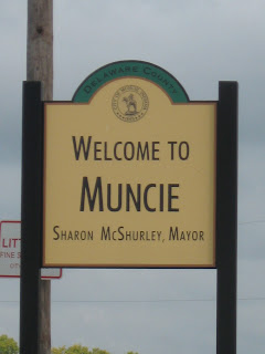
So, this isn't the greatest of signs out there, and the colors are a little bland, but it does feature the seal of Muncie, which does include the Appeal to the Great Spirit statue, which is the closest thing to a symbol that Muncie has. The small appearance of the sign does make it hard to see the city seal up close though. What the sign also indicates, what many other signs show, is the name of the mayor, which brings up a pet peeve of mine when it comes to these signs: why is the name of the mayor (or governor as some states have it) on these signs and is it at all relevant. First, as a traveler through a community, wouldn't you be more concerned about what town you are going into than the leader of said community, it doesn't appear to be useful information. Second, as a resident of the town, why do you have to be reminded of the name of your mayor when you probably already know who it is. To me, having the name of political leaders on these signs is just useless; it tells you little about a community, about its character and its values. And, there may be some cost of having to replace the signage, depending on who’s footing the bill for the sign of course.
To me, there are some things that would be more useful on the signage than others, some things that are important to have versus trivial things that tell you nothing, some do's and don'ts:
Good things to have:
-Attractions (tell us what your town is famous for, whether it is a university or some landmark, this tells you what the community views as its most important feature)
-History (while establishment dates are okay, if your community had some historic event take place that it is proud of, it should be mentioned, there's nothing wrong about learning some history along the trip)
-Geographic References (it's simple, but it still tells a story, whether your location is the Crossroads of America, the state, or a county, or if it is famous for some natural feature, being on a river, a lake, or in the mountains, if the nature feature is what that town is known for then it should be mentioned, or even incorporated into the sign's design)
-Schools (while saying you’re the home of the Wildcats or whatever is not of great importance to the traveler, it still tells us what your community is proud of, and to many small towns that may very well be the local high school)
-Famous People (again, while I may not necessarily care if so-and-so was born or lived in your community, the town may think otherwise and be proud of being home to such people and there's nothing wrong with that)
-Festivals and Events (some communities are well known for what takes place in their towns each year, and may be proud of that event, and it also serves as an advertisement for that festival to passerbys)
-Unique Signage (simply speaking, entrance signs that are not designed as signs, but as something else, perhaps as an item that represents that town’s main export, if it looks different from a normal sign it’s bound to catch the attention of the visitor)
Bad Things to have:
-Political Leaders (again, this is simply not needed, it tells me nothing about your community and odds are I don't care who runs your town, it simply serves as a place to show off the names of the winners of political contests)
-Catchphrases and Slogans (words such as "progress" and "pride" tell me little about a community, it's just some wording that sounds nice. And while your town may indeed have pride in themselves and may be a Progressing community, so what, most communities will have pride, and even commit themselves to progress, it's just generic words that could be used in any other community, in other words, very unoriginal)
-Websites and Phone Numbers (fortunately there aren’t too many of these, but this is just more clutter, if the site is easy to remember then it may serve a purpose, but if it consists of several dashes and hyphens then there is no need for such a site, again, the same with phone numbers, of course many businesses do this same thing so we shouldn’t necessarily blame the towns for putting this on their town, but if a website is all the town has to offer I’m not impressed)
Of course, all of this is just my personal opinion, maybe including the name of the mayor is really a great idea, but as I’ve mentioned before, these signs should be about the community and about its culture, not about who is running the joint. This is the first impression most get when entering a town, and while some communities may not think too much into it, it sets the pace for what to expect from the rest of the community. Now the design aspect of these signs is a different matter, one I may address later, but this was more about content and what the content should be. And while this may be a feature on mostly Indiana town signs, the principles should apply anywhere else where there’s a community that wants to welcome its visitors. Later on I may share more of these signs as I take a closer look into various communities and their signs.


No comments:
Post a Comment